
Designing the energy customer portal to improve clarity and self-service
Project overview
Alpiq is an electricity provider offering residential energy contracts.
The objective was to design a customer portal allowing users to:
Monitor their contract and consumption
Access billing information
Update personal and banking details
Manage key lifecycle events like moving
My role
Product Designer (UX & UI)
Context
B2C web platform
Focus
Information architecture, dashboard design, account management flows
problem
Energy customer portals deal with:
Financial information (monthly payments, invoices)
Legal contract details
Personal and banking data
Administrative processes (moving, contract changes)
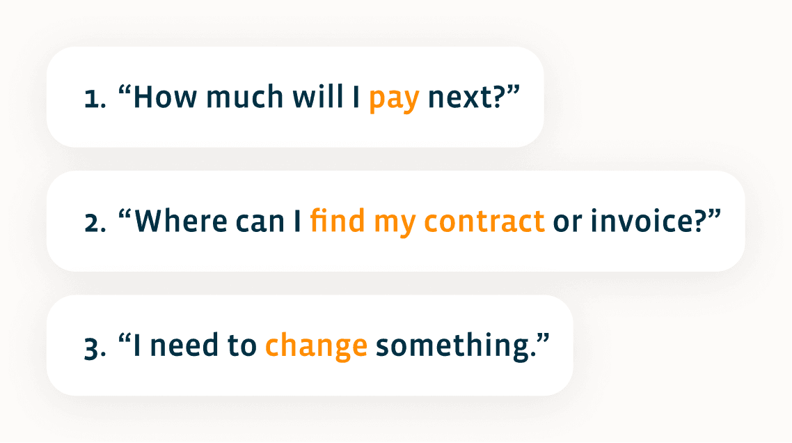
Users typically arrive with one of three intentions:
Design approach
Instead of designing feature by feature, the experience was structured around user intent priority.
We identified 4 primary needs:
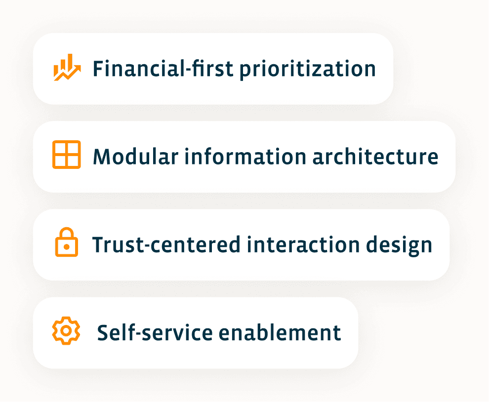
Each screen was designed to answer one dominant user question.
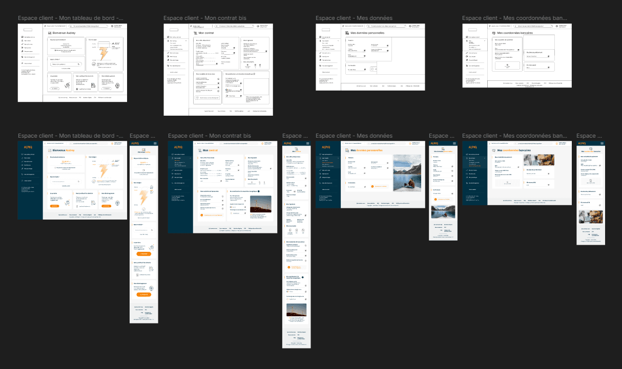
Solution
Dashboard – Prioritizing financial reassurance
Core question:
“When is my next payment and how much?”
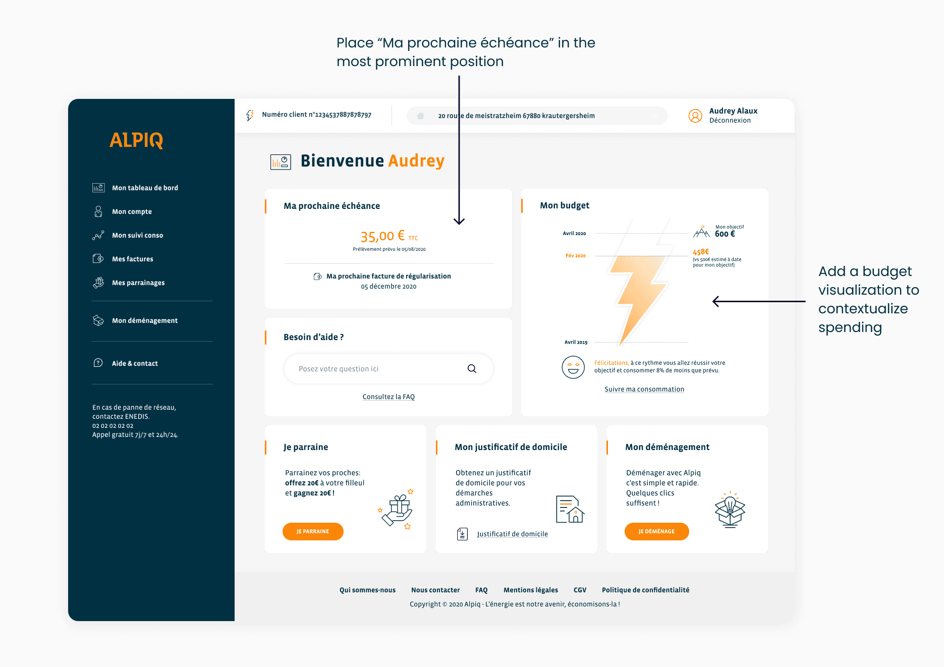
Why this structure?
The goal was to reduce anxiety immediately.
Before exploring features, users must feel financially informed.
The dashboard answers urgency first — exploration second.
Contract page – Making complexity digestible
Core question:
“What exactly is my contract?”
Energy contracts contain technical information:
Tariffs
Power
PDL numbers
Billing modes
Green energy contribution
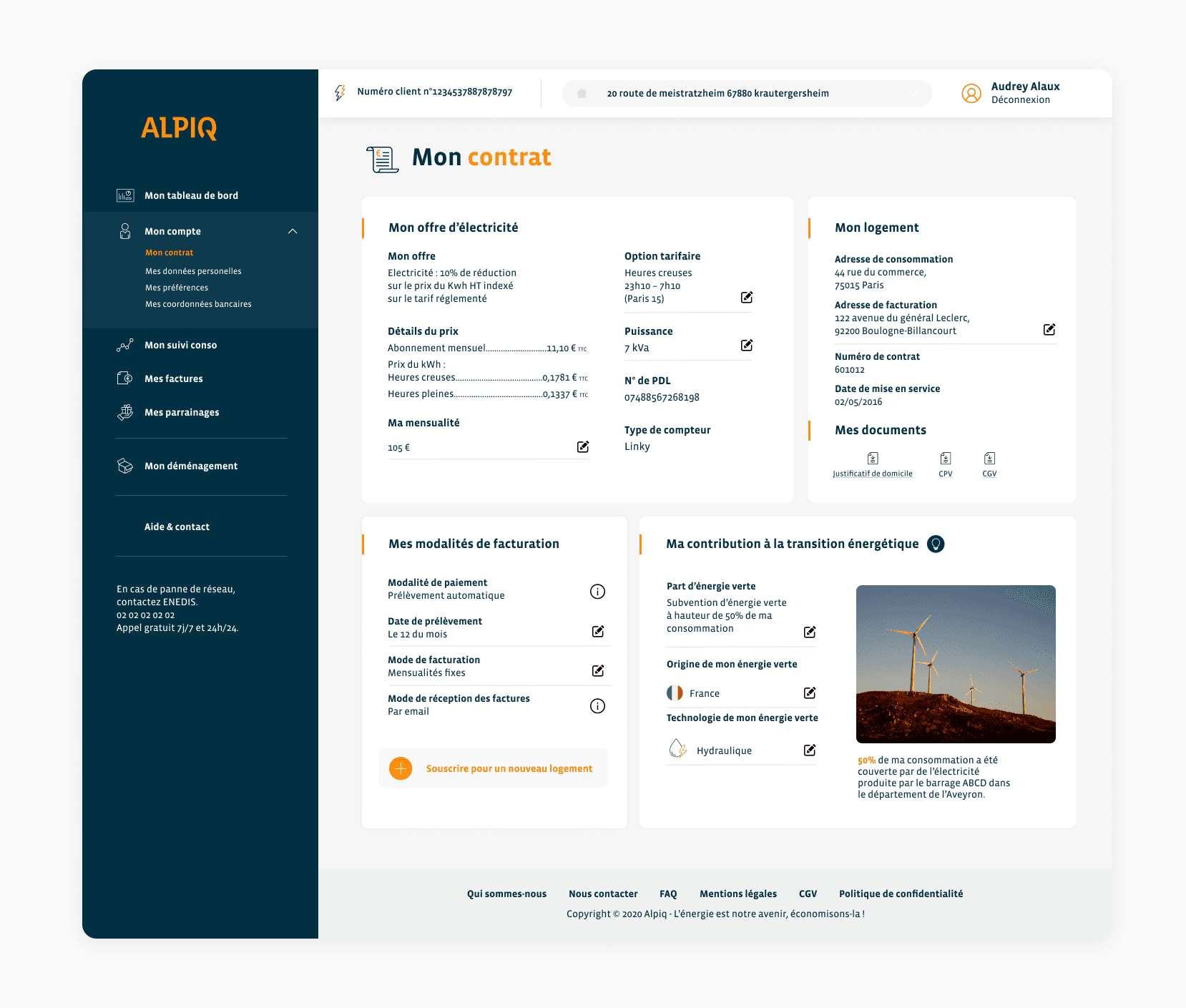
Why this structure?
Contracts are dense.
Card-based structuring reduces cognitive load and improves scanning.
The layout transforms a legal document into a readable interface.
Personal data – Designing for trust
Core question:
“Are my personal details correct and secure?”
UX Decision:
Clear separation between Titulaire and Co-titulaire
Uniform edit interaction
Reduced visual noise
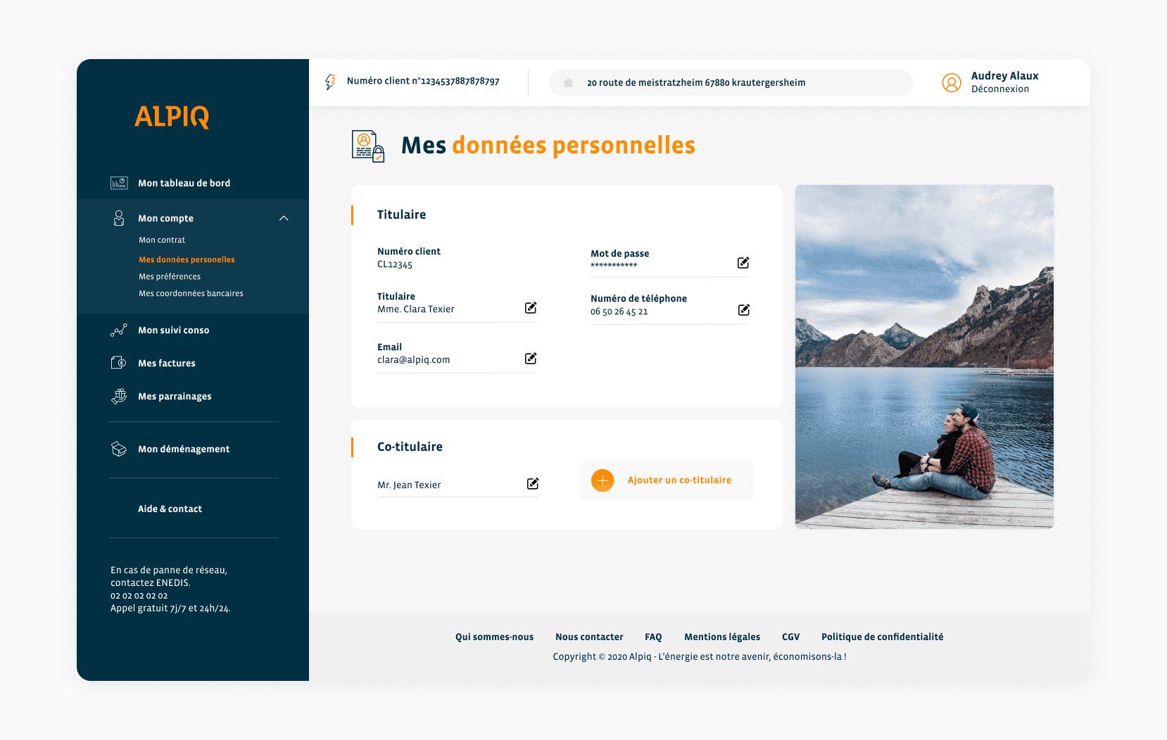
Why this structure ?
Sensitive data pages must feel stable and controlled.
The design avoids decoration and focuses on clarity and reassurance.
Banking details – Clarity for financial confidence
Core question:
“Is my payment method correct?”
UX Decision:
Separate IBAN, SEPA mandate, and payment schedule
Clear structure for payment frequency
No visual overload
Editable but not intrusive
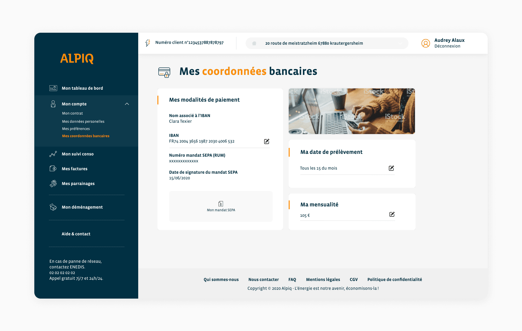
Why this structure ?
Banking pages are high-trust environments.
The design favors predictability over innovation.
Impact & Business
The redesigned customer portal contributed to a clearer, more transparent, and self-service-oriented experience.
Improvements included:
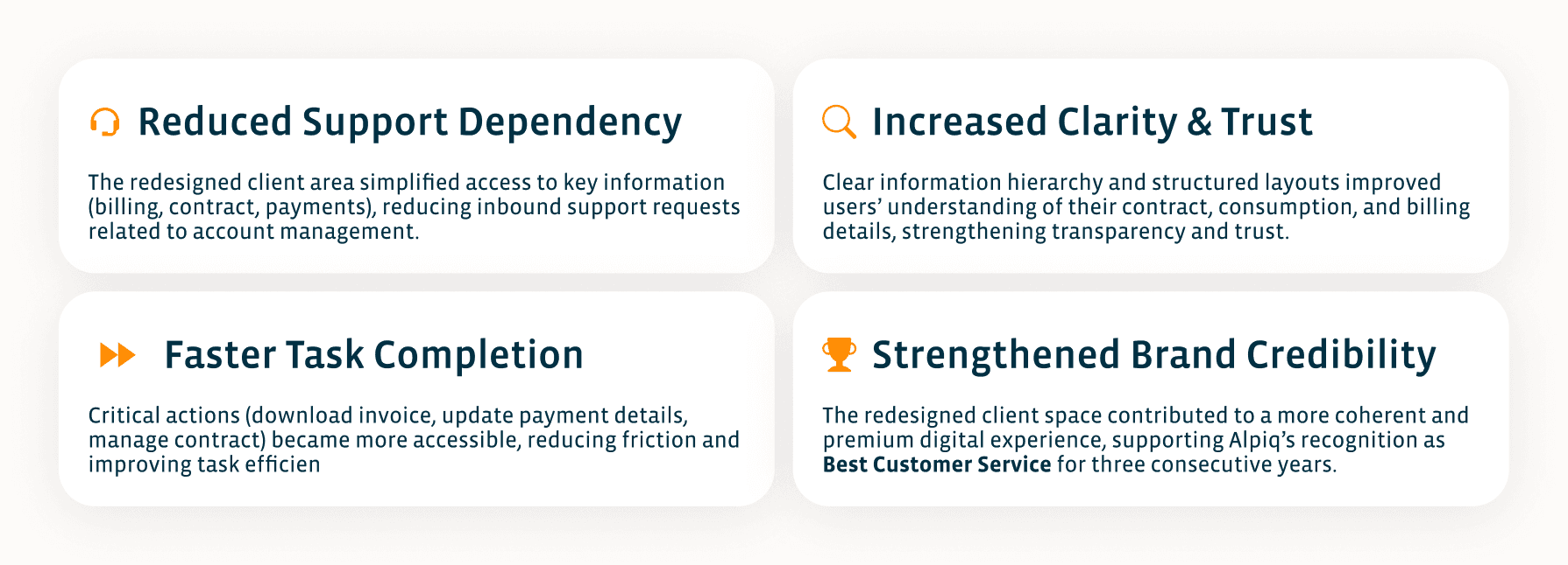
The year following the redesign, Alpiq was awarded “Best Customer Service of the Year” for three consecutive years.
While this recognition was the result of a broader organizational effort, the redesign of the customer portal played a role in strengthening the overall customer experience and perception of clarity and reliability.
